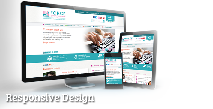
While more expensive to design and implement, Responsive or Dedicated Mobile Design will make sure your website is usable on all devices. Does your website need responsive design?
There are two main ways to go mobile -- one is dedicated mobile (which used to be the only way) and the other is Responsive Website Design (which has become popular because of its flexibility). Dedicated mobile sites are a second site, usually built in a sub-folder of the site. They usually contain a pared down version of the site, rather than the entirety of your site content.
With Responsive Website Design, your mobile site is really just your full site, but displayed for mobile. What we do is make your site "respond" to the width of the browser viewing it. So all of your site content is displayed, but it's displayed in a way that's easy to view on multiple platforms. So if you are viewing your site on a tablet, your site design will be reshaped a little to work well on tablets, and your page content will be reshaped a little to fit nicely on tablet. For example photos might be smaller, and dropped down below paragraphs, and chunks of content will stack on top of each other, rather than side by side.
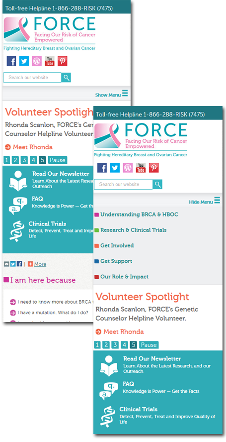
Then as the browser gets even narrower, maybe for a large phone or a small tablet, the site design and content is reorganized even further. And finally it gets all the way down to phone size, and looks just like a dedicated mobile site, except it has 100% of your site content. Menu systems will collapse to an menu icon that when clicked, opens your menu pushing the rest of the content further down the page. So everything that is available in the larger view is still accessible.
I'll show you a few examples. Take a look at these sites:
www.environmentandhumanrights.org
www.facingourrisk.org
www.woodcarvinggallery.com
These are sites that we recently made responsive. Look at them on your full computer, in a regular browser. Then grab the side of your browser and slowly drag it to be narrower. You'll see that the site continues to fill the screen at 100%, but at certain break points, the content reorganizes itself to fit better in the space (rather than sidebars, the content is stacked, etc.). Then when you get all the way down to the width of a phone, the site looks like a mobile site.
Our recommendation is usually to go with responsive over dedicated mobile. One reason is that there is such a huge array of browser widths these days -- having just "full" and "mobile" doesn't account for all the variations in between. But another reason, which is at least as important if not more important, is that people want all of your site content on their mobile screens these days. They don't want to have to click to the full site to get that one piece of information they are after. They want to be able to browse your full site while on their phone at the doctor's office, or on their tablet while watching TV at home.

Give us a call. We'd like to talk with you, understand your needs, get to know you. There’s no obligation.
541-961-8907
If you’d prefer, send Jack an email.
541-961-8907 • Portland, Oregon
Web Design
Database Development
E-commerce Websites
Dedicated Mobile & Responsive Site Design
Email Templates
Custom Wordpress Sites
Custom Content Management Systems
Contribute Support
Custom graphics, logos, and web banners